Showing posts with label 2D Visual Design. Show all posts

Saturday, 14 March 2015

Photoshop Session - Anthropomorphic Character Design

In our last morning session we studied anthropomorphism. This is very similar to personification, in which a living creature or natural element is presented in a human form; with several recognisable physical traits such as a torso and limbs. We were then asked to create this in the form of a frog. Below is my quick reference image guide. I planned to include clothing but as we were limited to only the time in the session, I stuck with just the bare body.


Here is my final anthropomorphic character. I decided to make an accurate-ish construct of a male body crouching with a thoughtful posture. I mainly used toning references from the top left hand corner image (reference guide above) of a rainforest frog which has some amazing contrasts of colour on it. Overall, I really enjoyed mixing brushes around on thing like the eyes and hope to do something similar in the later.


Friday, 6 March 2015

Photoshop Session - Paint Over Tutorial

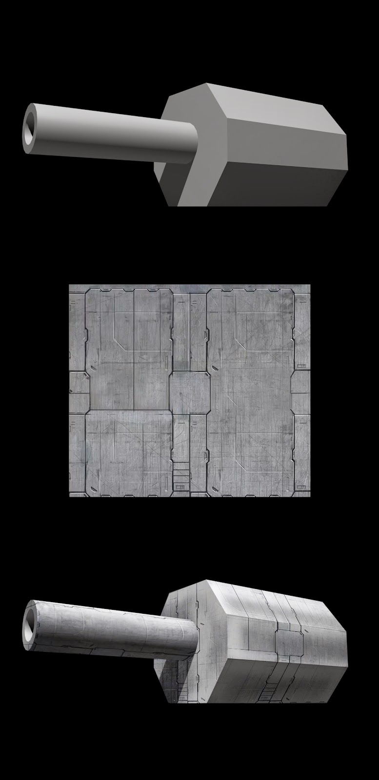
In a previous session in February, we learned about painting over rendered 3D objects by using Photoshop and placing textures over them. Firstly, we were given a simple gun turret image with a metal plate texture. Secondly, using Photoshop's transforms, we manipulated the image over the top of the model by selecting areas with the polygonal tool. Thirdly, we then wrapped it over the surface using tools such as warp and perspective. In addition, I folded the 'face' of the barrel with the warp tool bit by bit to get a smooth curvature. Lastly, it was just a matter of finding the best blending mode to make it translucent onto the hard surface; with 'overlay' working best in the end. 


After we had finished the gun model, there was a somewhat more complex Vampire image that we could play around with and place our own images over. I decided to go for an elephant texture which worked out quite well in the end. I painted over this using the blending mode 'colour' to get the purple and yellow skin tone. Furthermore, I added some detailed features like claw marks to bring the static image to life. This procedure of layering elements is almost limitless and really useful for quick concept work. I will definitely be using more of the technique in the future!


Thursday, 5 March 2015

Visual Arts and Animation - Steampunk Assignment

Another two-week homework assignment was set again; this time to design a Steampunk concept. From looking at a lot of images of the retro mash-up genre, there is a slight cheap feel to it. One reason for this could be that it's mainly a fan-made driven genre. Unlike strapping cogs on a gun and calling it Steampunk, I spent a lot of time trying to work out systems and machinery that would both be practical and useful.


Above is my research and inspiration images that helped me towards my final piece. There was also a wide variety on DeviantArt gallery that was useful in deciding what route to take between a character, vehicle or device/machine concept. Below are my designs ranging from a penny farthing train, a voltage powered musket and a steam powered body support rig.


I decided to go with my steam powered support rig in the end. I really liked the idea of switching the distinctive industrial revolution Steampunk work and have a western American character. In addition, I gave the character retro-futuristic inventions (a common theme in Steampunk) like a wireless Morse code communicator and a metal exo-suit giving the bounty hunter advanced support and strength.


Underneath is my final digital piece. I decided to try and use only three different brushes to get a blotchy tone and make an atmospheric feel to the heat of the sun on the great deserts of western America. Overall I spent ten hours on my final image. One of the main challenges to 2D art, in my opinion, is a consistent path of light to shade which I think I just got away with. On the other hand, I really enjoyed making the distant mirage on the horizon; mainly because I have never painted one before!


Thursday, 19 February 2015

Visual Arts and Animation - Lava Monster Assignment

Our homework assignment was following from the lava tutorial session, to make a lava monster! Underneath is my reference and research images guiding me with where I wanted to go after choosing my final concept from my experimental designs. Previously, I had found quite a few images through DeviantArt gallery which aided me in deciding the monsters visuals.


Below are my three ideas of a lava monster. The first design is a massive crawling mountain of molten rock. The second is based mostly off of a shrimp and seahorse where the legs have been replaced with liquid lava helping it move along similar to a snails slime trail. Lastly is the monster I choose for my final piece which is a colossal three miles high; similar to the titan Krono's from the film Wrath of the Titans.


For the final concept, I made a full body profile and alterations to features such as the face. To the left I have included a small diagram comparison for the sheer size of the monster. For the composition to represent the overwhelming scale of the creature, I had to think quite a bit on the placement of a camera angle called 'worms eye view' (a really low head-raising shot). To achieve this, I placed my iPads camera close to my feet while standing, walking and stomping, setting various timers, to get a realistic angle.


After finding my favourite image I took, I imported the photograph into Photoshop and worked over it with basic colours; adding a dim overcast sky to bring out the silhouette. Here is my progress in four segments of my final piece concept. I called the lava monster Godono's The Goliath (as though a big brother of the titan Krono's like from the film Wrath of the Titans). 


Below is my finished piece taking around nine hours. I needed an element of lava to stand out in the image as the dark rock colours blended together too much. To support this, I made it look as though the monsters wrists were cut; seeping lava down the hands and dripping to the ground below. To make the lava look as though it was actually falling towards the point of view, I used image references (I took for an art project back at college) where I placed my camera under falling paint which has a similar density to it. Furthermore, I really enjoyed using only a Photoshop brush pack made by concept artist Jonas De Ro with a wide range of components and shapes.


Wednesday, 18 February 2015

Photoshop Session - Lava Tutorial

This session we learned how to create realistic lava with several techniques. Below is my digital palette in Photoshop where I played around with toning and placement. In addition, I watched some footage of lava movement, as its not a still object; to better understand how it flows. Our teacher showed us how to use Photoshop's effects to further manipulate a working layer which also allowed me to use the brush to paint with the applied effects.


We were then given in our session, an image of a rocky creature model to sculpt and paint over lava cracks and fissures around the form. Below is my finished piece that took about two hours. I added in some context and background to make the model feel more alive which I thought went quite well. Furthermore, I attempted to include one-point lighting as the models highlights are reflecting white light.


Overall I found this session was a helpful insight into constructing a natural element (molten rock) and its placement over shape. 

Thursday, 5 February 2015

Photoshop Session - Pixel Art Tutorial

In our last session with Photoshop we created pixel art. Following a tutorial into how to accurately align the angles, we had to make a fire hydrant using only five colours of red and black. The image below is what I was able to make in the four hours we had (enlarged for full view). I created the Tardis from my imagination as well as attempting to construct Flappy Bird in a front viewpoint! One of my favourite games on the Nintendo Gameboy Advance SP was The Sims Bustin' Out which was in a pixel isometric perspective; I just had to make and include the player's character!


Underneath is the accurate dimensions of the singular pixels in their form. What I believed most fun when creating art like this, is how much detail you have to try and place with as few strokes as possible. I have really enjoyed experimenting with small colour use and hope to create some more art like this in the future!


Tuesday, 20 January 2015

Visual Arts & Animation - Anatomy: Muscle Assignment

Our first two-week assignment for the new term was to study the Human Anatomy. Continuing from the last analysis of the Human skeleton, this time we looked at the key muscles of the body. Below is my diagram listing the main muscles with a colour marker. While focusing on the main muscles of the average male, I highlighted more complex forms in the magnifier circles. In addition, I got the chance to use watercolours; as this is something I have had years of practise with and am comfortable to use.


Below is my second study focusing more on the muscle detail around the body that I found interesting or had not looked at before. For example, the coracobrachialis and the serratus anterior muscles located under the armpit. Furthermore, I briefly covered how certain muscles expand and contract like in the gastrocnemius (calf) and the brachioradialis (situated on the wrist).


I really enjoyed learning new muscle groups, like that of the face and think it has been a huge help in understanding the form of the human body even more. Below are the two links I used for reference in my study. One again being the amazing website called InnerBody which lets you understand the system of the muscles in an interesting and interactive diagram. The other is a book called Atlas of Human Anatomy for the Artist by Stephen Rogers Peck as suggested by our lecturer.


Friday, 16 January 2015

Photoshop Session - Lizard Creature Tutorial

In our first session of the new term, we got to watch another great tutorial by artist Feng Zhu. In the online lesson, Feng Zhu went through the basic elements to starting off a digital art piece. Several techniques were covered including how to place textures along with a short example of how to create bounce and backlit lighting. It was then our turn to try out the methods of practise. To make things easier in the time we had in our session, we were given some reference images and a line drawing to help us re-create his work.


Above is my progress towards my final piece. I started off by blocking in the simple colours and then adding in the bounce and strong contrasts of light with a soft edge brush. The second step was just refining what I had done and tidying up values with the areas of the body. I found it difficult to tone the arms as the actual angle of the shoulders are distorted in a concave manner with the chest armour. However, after cleaning the shadows up with a hard edge brush, I focused with more detailed around the upper torso. 


I was then able to go onto Google search and find a matt high quality free image of a gecko texture; that I used to give the detail of the lizard skin texture. Above is my almost finished piece I made, which I am rather pleased with given that we only had about four hours to make it. In addition, I found the texturing rather easy to do with the help of the warp tool on Adobe Photoshop CS6.


Above is the original free texture that I used multiple times (as seen closer up below) on the arms, head and neck area. Using 'Paste Special' we could mask around the edge of the areas we wanted covered and then simply wrap the image using the warp tool. To match the image colour to that of the lizard's, I converted the colour in the image to black and white and then changed the blending mode to soft light.


Thursday, 11 December 2014

Photoshop Session - 1, 2, 3, 4, 5, 6 & 7

In our first term, we have produced seven pieces of work in each session of Visual Design with Steve Brown. I was planning on uploading my pieces weekly but I can see my progress a lot clearly in one post. I really enjoyed every task that was set us when creating a digital image, as this is something I have a particular interest in.


Above is the first piece we were asked to re-produce from just an image on paper that was handed out. I began by working on a dark background slowly building the layers and tones. Trying to find the identical colours of the old lady, was the toughest and most time consuming part. However, after four hours I was able to leave it where I was, and be happy with it.


In our second session we created a Caterpillar Insect from a specific technique in Photoshop following instructions. I found this task really useful for quickly creating a concept and building up the structure with shade. I placed the three stages of my progress above and think its quite a good practice to look back the stages of how you have worked.


For our third session we got to create three creature silhouettes after watching an amazing tutorial by artist Feng Zhu. We could then, using black and white balances, develop on our silhouettes and paint in the body's that we wished. This is really useful when generating a series of designs and building upon them; for say a company in the industry who liked one.


Part of our fourth session involved manipulating a texture body map for a girl (one was provided as a base) and also creating a zombie texture as well as it was close to Halloween. This was a great insight into how they create 'skins' for characters in games and is something we will be looking into more closely next term.


Above are the stages of development and the 'almost complete' speed painting underneath that we were assigned to make in our fifth session. I really found this tough knowing that there was a limit to how many hours I had to work on it but at the same time found the challenge really fun. Like in the first session, we were given an image on paper to copy over the piece.


In the sixth session we learnt several techniques and watched a tutorial on tones and values. The image above is a diagram of how to place the correct shades on a solid object using a scale of 10, all the way to complete black. This was helpful in the following weeks assignment where we created a tank concept with one point lighting and shadows on it.


In our final session with Steve Brown using Photoshop, we learnt about proportions and the correct way to scale a figure or character by using the head as a height stature. For example, we used a Dwarf and Elf for the comparison. The Dwarf at around four to six heads high and an Elf around nine to eleven heads tall.

Monday, 1 December 2014

Visual Design - Anatomy: Skeleton Assignment

Our homework assignment for the seventh session was to study the Human Anatomy. I enjoyed learning several new bones and joint names as I have always been interested in the structure of body's and know certain aspects; but not all the names we have given them.


I focused on looking at movement and how the joints functioned, as knowing the mechanics is very useful for both concept work and character animation. On my second page of study, I attempted the angles of the skull from memory; in the art dept. at college, we had an actual donated human skull for still life work!!! In addition, I looked heavily at the spine and the individual vertebra.


Below are two links to the references I used in my study. One is a great website on teaching you how the body works and its functions and the other is an artist book suggested by our lecturer:

http://goo.gl/6cJZBQ

Tuesday, 25 November 2014

Visual Design - Perspective Lighting: Tank Assignment

Last week's assignment was to create a tank concept and introduce perspective lighting on the vehicle. I started by looking into how tanks functioned and their basic properties. I also wanted to include historical reference to tanks of the First and Second World War. Below is my main inspiration and research images that guided me toward my final piece.


As I roughly sketched out the well-known rectangular shape of a tank, I saw several possibilities of concepts. For example a raise able turret design with a 360 degree view and a compact front-wheel drive 'race car' tank.


I decided on creating my 'Mammoth' concept piece for the final design. I looked at Nasa's Land Crawler-Transporter for inspiration on creating a mobile 'city' tank platform. The idea was that it was capable of housing an entire army and efficient at a range of various tasks like ore mining, surface-to-air transport launches and firing two, eight tonne shells (simultaneously) out of its forty meter long cannons; at a distance of thirty five miles!


I am quite happy with my final watercolour and ink image. Although I did not get to work digitally this time, I found that taking my time with traditional methods like a ruler was fun. I left my pencil sunlight guides on the image to show how I had to set up the shadow lines of the image as the angle makes the object backlit.

Wednesday, 19 November 2014

Visual Design - Insectoid Character Assignment

A two-week homework assignment was set this time which was to design a insectoid character concept. Below is my reference/research images that helped me develop towards my final outcome. I was heavily influenced by the structure of the butterfly, an insect I have a fascination for as well as Ladybirds.


I then went on to see how I could manipulate several features of insects and shape them in to a human like figure form. I spent only several minutes on the designs below to get the general characteristics that I then went onto use for my final insectoid.


I noticed how several insects and bugs have a dome (elytra) on their back which acts as an outer shell that commonly the insects wings can fold up into. I really liked the idea of this incorporated in the body and I instantly then though of the 'Hunch Back of Notre Dame'...and so the Hunch Beetle of Notre Dame was born!


We also had to give the character a small bio. I decided as the setting was going to be in Paris, to create the insect into some sort of religious monk background. With the blueprint plan above I wanted to make a hood and henna-like tattoos on the insectoid to give the effect that it was a solemn creature and humble like in its stance as well.


Above is my final piece. I struggled many times with the values of the shading and point of lighting. After watching a tutorial with the group in a recent session, I was able to go over the composition in more detail and find a point in which I was happy with it. I really wanted to test myself again doing something I had never tried heavily before which was texturing mostly everything from my own photographs; and then mixing them with the blending mode in Photoshop to get the different elements into place.

Monday, 3 November 2014

Visual Design - Monster Assignment

Our homework assignment for the forth week was simple really as it was Halloween...to create a monster! Below are my reference images taking inspiration once again from one of my favourite game trilogies, Dead Space. I also looked at the TV series The Walking Dead and the film The Mummy for human aspects that we are so used to seeing and then manipulating them to create our worst nightmares.


For my initial rough sketches I was very undecided on what to make the character look like visually. However, I knew the human element I was going to put in to make it scary was the face, as its something we instantly recognise. 


I decided to create my monster with extended features of the human body, as though a morphed parasitic life-form had taken over. I also stretched the jaw out, sunk the eyes in and changed the angle of the sockets to produce more of a horrific glare to the face. 


Finally I spent around around six hours creating my final outcome below. I enjoyed trying out using only six different colours to create the entire image. Furthermore to bring out the proportions and size relationship, I made 'MUNCH' stand out at about 3.5 meters in height.


Sunday, 2 November 2014

Visual Design - Perspective Assignment

Last weeks assignment was to create a drawing using the technique of one-point perspective. I had already learnt about perspective drawing before watching the tutorial video and book pages on it. On the other hand, it was great exercise helping me figure out horizons as that was something I wanted to look into more. Below is my original sketch and rough digital toned piece that was a fun one hour speed-painting.


Monday, 20 October 2014

Visual Design - Futuristic Weapon Assignment

This weeks homework was to design a futuristic weapon that fired a projectile. Below is my reference/research images that helped inspire me to my final design. As games can have more involvement in weapons than film, my primary two influences were Lost Planet 2 and Dead Space 2.


From researching and studying the components of a whole range of actual guns, I wanted to create something that was believable and could be constructed in the next century.


I looked into a range of orchid flowers and exotic floral to help with my idea of a 'blooming' gun that opens up and creates an arc of power for the bullets to accelerate their flow through. The image above of the flower 'Hymenocallis' was my main vision of shape for the blueprint.


Below is my final (fine-liner coloured) concept of my gun I called 'FLARER'. I am really pleased with the technical drawings of how the gun functions and its features that blend today's gun technology. Although I could have rendered the piece digitally, I feared I would have spent to much time on it and not enough on the experimentation thought-process.