For our last milestone of the unit, we had to complete both our practical work for the hand-in submission as well as publish our creative output online; to a portfolio site such as Artstation or make our own website.

I updated the art bible of our game towards the previous milestone. Here I have the title page with the new logo I created.

The contents overview page of the new updated art bible.

The final build of our game features a new textured spirit character close to the one displayed above (also detailing overall our art style in terms of the environment and scale etc).
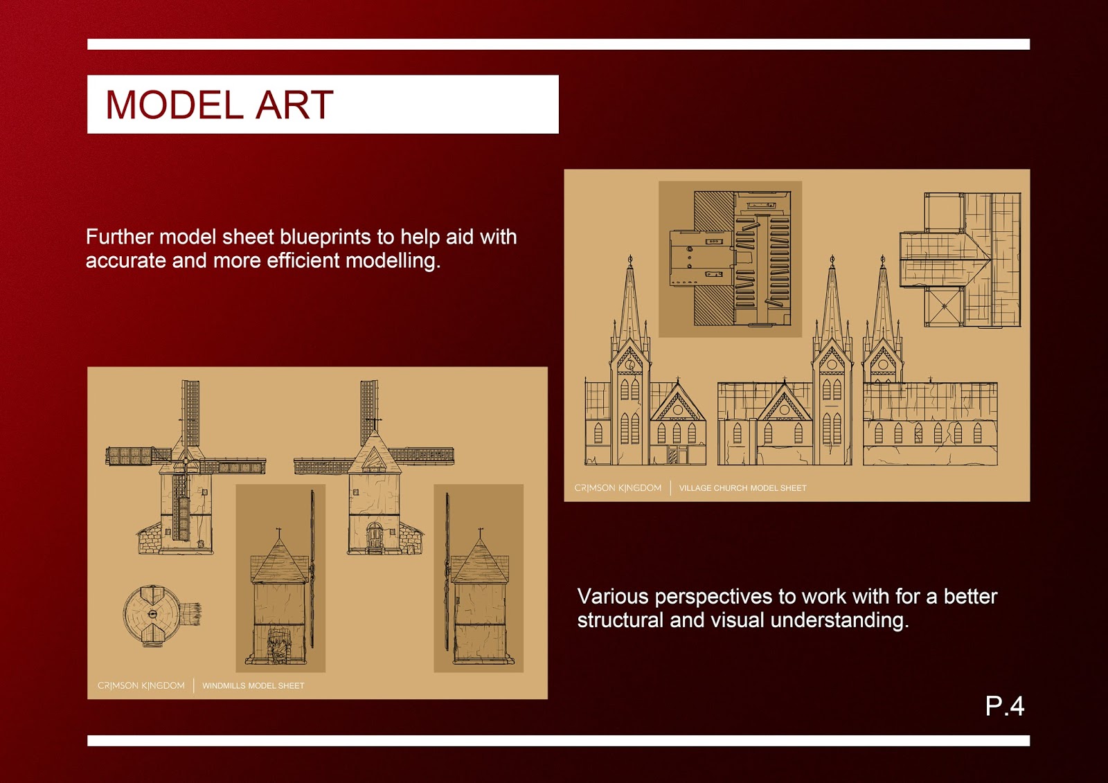
Some further blueprint model sheets I created to help our game designer with modelling from my original concepts.

This page shows some of the pick-up items as UI icons (found in the game) I made from the original concepts.

The level of detail page indicating some models from within the game and assets using the Unity Level Of Detail (LOD) feature for overall gameplay optimization.

A screenshot from within our game showcasing some of the effects we've added to the camera for a cinematic and more interesting feel (such as motion blur, a light vignette and warp screen adaptation).

In addition, another unique feature we implemented into the game was an in-game menu system. The menu is displayed in the form of a phablet (tablet/phone) and can be opened and closed using the keyboard shortcuts displayed at the start of the game in the tutorial or main menu. Since the last art bible the phablet menu layout has improved greatly from visual presentation to gameplay performance.

Our games colour palette hasn't changed much since last time, although the introduction of a new component in gameplay (an alternate dark parallel dimension) has been an opportunity to flip the above palette around and experiment in moody/dull colours.

Since the last unit, the components of light and atmosphere in our game has changed considerably. The day to night cycle idea was removed for a more realistic and complex sky box system, utilizing the Adam Unity demo pack. Elements such as dust particles, waving trees in the wind and moving sea water all add to the connection of the world's atmosphere.

Above is the second atmosphere and environment page, showing the alternate dark parallel dimension as well as one of the pick-up items found only in this dimension that glow a bright red (one of the core elements to going in and out of the void portals to the alternate world is to find all of the six items).

Furthermore, the features of the phablet in-game menu allowed us to utilize and present elements. For example, informative articles entries of the monuments and landmarks from across time, in a way making the game more engaging and informative overall.

This page in the art bible details the organisation of the entire Unity project. As mentioned before, creating a large world for a game causes for an extensive organisation of folders and laying out of components clearly is key.

With the additional ingredient of an alternate parallel dimension, we looked at references to further inspire us and discussed more options and ideas; pushing the 'portal to another world concept' to be as interesting and intriguing as possible. Above are stills from the TV series Stranger Things (2016) and screenshots from the game The Room 3 (2015), both a huge inspiration later down the line to our work.

As a supplementary part to the transition into the parallel dimension, I was asked to create a portal screen, disguising the jump between the change of lighting for the two (which looked a bit laggy and just didn't flow well). Here is the final product of the portal design. I adjusted the end exposure and contrast when exporting to make the image livelier and look like a harsh visual effect.

Towards the end of the unit and for the last hand-in, I made a range of promotional box art. I really enjoyed the process of illustrating the front cover design and adding the fine details to the case layout. Above is some of the cover design sheets I made working from sketches that got approved from our team after some refinements. Elements from just the position of a character can extremely affect the viewer's impression and so featuring the protagonist in the right pose was important to convey the right mood.

I found inspiration towards our cover design from other popular triple A games' box art (solely featuring the protagonist) and thought that the style 'negative white space' worked quite well with the ambiguity of the spirit character, as well as the mysterious world of Crimson Kingdom.

The image before the above is the framing panel I created to compose the collage images and to then make the inside of the negative silhouette for the cover. This is the CD disc art I quickly put together again using the promotional framed collage. I really adored painstakingly adding little details in from icons, logos to small print; making the box art not only look more interesting but also more professional.

Above is the final design of the box art with the front, spine and back pieces. I had a lot of fun aligning all the components and details (from the front review star ratings to our teams Project Peacock logo). Overall, my journey as Concept Artist working in a small team, for this unit and year, has most certainly taught me numerous things as well as a stronger independent learning aspect that will surely help in the future.