Tuesday, 8 December 2015

Maya Modelling Assignment - Knife

Towards our final game asset model, we worked on a model of a knife as practice towards our object of choice. In each session at Uni, I screen captured the process from Maya into ZBrush.


Above is the template image we all were given to work from and is to scale in pixels.


To start off block building the knife form, we used the quad draw tool. This was a very quick an easy method of creating quads, firstly around the handle.


Above I extruded the buttons and moved the vertices on the edges to match the reference image below.


While adding in edge loops, I made sure to use the center alignment function in the selection panel to the left.


As I extruded up on the handle, I deselected the circular end parts which would later become the screw holes.


Here I have moved half way down the blade using quad draw while tying to keep the edge flow along with the blade face.


Although the model was being designed as a high poly, I shaped a lot of the construction in a low form and then built upon it.


During the building of the knife, I switched from working in Maya 2015 to Maya 2016. The change over was not that different with things like the interface, although the icon shortcut images have been updated. On the other hand, the 3D scene view background colour change is easier to look at; as compared to the harsh gradient in the previous version. 


For the center metal blade part, I duplicated the top handle, re-formed the depth of the piece and then sewed the vertices with the blade base. Although this took quite a bit of time checking all of the joining pieces, I was quite pleased with the result as seen below.


With the quad-drew blade, I mirrored the left top side and made sure the tool joined the vertices.


Above and below, is the before and after I re-positioned after the mirroring. I was extremely happy with the front view perspective as seen here in x-ray view; highlighted along the cutting edge.
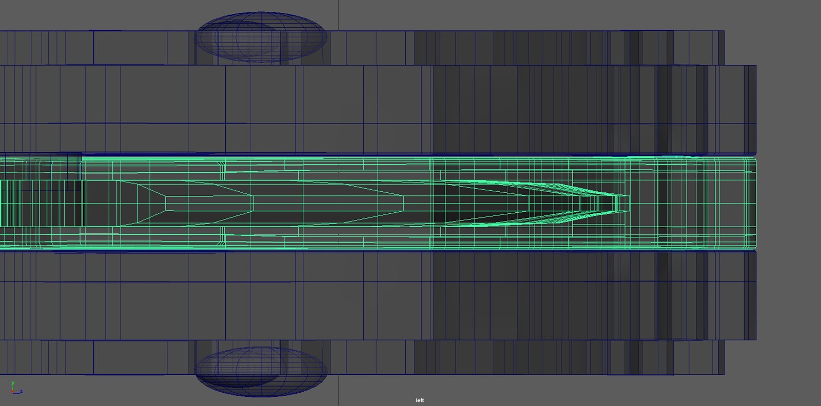


While working I made sure to keep saving, deleting history and to check four different views in the scene for an accurate and clean model.


After finishing the bulk of the handle, blade and screws, I added in some text for both sides of the flat face of the blade for added detail.


The next step was to UV Unwrap the model. Above I began while following the tutorial. However, half way through I ran into some problems with the separation of UV's and had to ask for help from our session teacher.
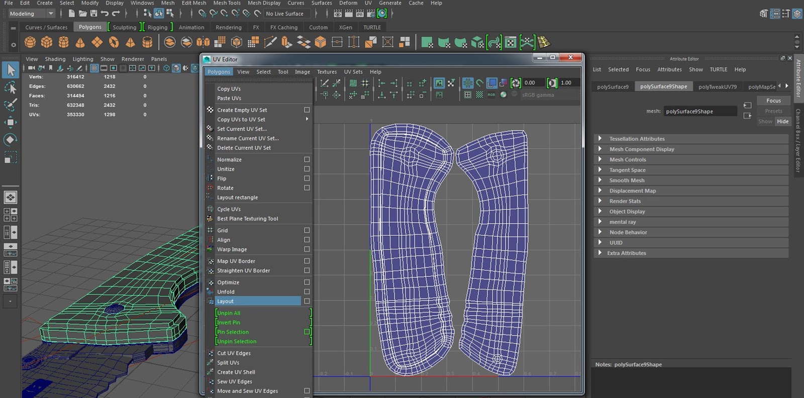


Overhead is the final layout for the handle top which I unwrapped and re-positioned with help from our sessions teacher, using new features for Maya 2016.


Here is the final handle side smoothed/divided in Maya. This process adds polygons and smooths edges that may be too hard edged.


Once placing my tool object (an .obj file) into ZBrush, I auto-grouped the UV continuity. This meant that if I was to highlight a selected viewed item, it would highlight the UV face geometry.


After dividing the mesh five times in the geometry tab to the right (to smooth out again) and isolating the panel without the screw sockets, I began adding surface detail; using the Surface NoiseMaker feature as seen above.


After applying it to the mesh, I clicked on show UV poly groups to view the topology which I thought came out rather well.


Here I have a before and after of the handle panel isolated with the surface noise added. Over the previous sessions, I just started to get used to using the controls which aren't that entirely different. On the other hand, from using Maya short cuts frequently to just ZBrush's, was really challenging for me.


As the weeks went by, more deadlines and content for our second (Games Production) Unit was needed. As I was the concept artist for our group's game, I had to create a lot of material in a short space of time in high detail (for other members to work from). On return to this assignment, it felt like I had fallen behind quite a bit and decided to catch up with my own game asset model; required for the (Games Art Unit) Winter Submission.


Above are two renders I made, one made in mental ray and the other in TURTLE. These are plugin rendering applications that generate high quality images in Maya. I was pleased with how these came out in the end but also disappointed that I did not get to generate normal maps in xNormal and texture using the software Quixel. 

Thursday, 3 December 2015

Winter Submission: Milestone 4 - 2D Intro Cut Scene, Box Art & Storyboard

One of the major components we had to have in our games Vertical Slice, was a 2D intro cut scene using 2D assets in-engine. As the concept artist for our game, I took the lead role in this task and planned to create stills that we could then animate.  


Above is the first still for our intro cut scene. The text instantly informs the players the setting and year. All of these shots have been digitally painted in Photoshop; most of them taking from around three to six hours each.


The image above is an ariel shot overlooking the city of Naples during the Second World War. I really enjoyed forming the angles and composition for the stills and also trying to closely match the sketches from my initial storyboard.


I used several reference images to create the best pre-visualisation before digitally painting over them using several brushes to suit the right textures and lighting. The Consolidated B-24 Liberator aircraft in our story, is transporting the protagonist William to an airfield near Naples, Italy.


This interior shot was a tough challenge with all the sharp angles leading to the centre.


Above is another still I made, this time of the cockpit of the B-24 Liberator looking out of the left window. I wanted to get a variation of both interior and exterior shots in the cut scene to get a sense of perspective of the aeroplane in the sky.


Here is an extended shot I made that is held for about eight seconds before changing. I made sure to add detail but not spend too much time on things like the rivets which is actually just the same rivet, duplicated several times and then copy and pasted vertically and horizontally.


I thoroughly enjoyed and looked forward to making the action stills which start at this shot above of the Liberator getting hit by a sudden shock wave.


One of the trickier shots to paint was this one of a massive smoke plume. I had to use several photographs to understand the rolls of smoke, as this is something I have never done before. To make a dramatic impact of the eruption column, I placed the Liberator over the harsh shadow from the plume; isolating the size comparison.


I found the still above challenging, although I knew what I was doing. Several layers had to be blended in the options panel and I had to filter through them quite frequently to match up with other contrasts in the image. Most of the flames were from my own photographs I took and then simply painted over the top and adjusted with light levels etc.


As the project drew closer to the last deadlines, I realised I was not going to finish all of the stills in time. Above is the last shot which took some time to plan. I had to sum up three components of the intro story into just one image; Mount Vesuvius erupting, William getting captured (by Nazi Germans) and his body language conveying his emotions, all at the same time!


After the previous still, an impactful title of our games name (as well as William's status report) appears reading 'Missing In Action'. Our vertical slice is at the beginning of the story and follows straight after the intro. I would have liked to have edited sound to our cut scene but as all the deadlines came closer I had to prioritize essential jobs. However, I was able to find a fantastic royalty free horror score pack that we then used as our main theme and another track for our main menu scene.


This is our games box art for PC release (as if it was an actual studio product). I absolutely enjoyed every bit of making this, as I have created several DVD covers for college and personal projects before; and love presenting the content in this form. I made sure to include fine details from the age rating, right down to the small print for an authentic outcome!


One of the more important things I made halfway through our project, was a gameplay storyboard. I neatened my original rough Biro version into a digital one above which is almost like a step by step of the stages of gameplay. Furthermore, I included small tone values to push the viewer's eyes to what the scene looks like, rather than just black outlines. Overall, I have thoroughly enjoyed this unit. Although there were many stressful times and lots of organizing, leading up to the final hand in, I found that creating art material as visual problem solving for our team exhilarating.

Winter Submission: Milestone 3 - Art Bible, Renders & One Sheet

Our third milestone, for our Winter Submission was to have a working build with key user experience of the core gameplay. Here I have a selection of renders for the church in our game, as an aid for the environment artist to build from, as well as our final Art Bible and One Sheet.


Using a plugin in Maya called mental ray, I composed several shots of the church I made for our groups environment artist to go from. I had planned to digitally paint over these in Photoshop but decided to spend more time on other essential things like the 2D Intro Cut Scene. Furthermore, I would have then gone back to these afterwards, if I had time left over at the end.


Above is a shot looking down the centre aisle of the church lit up by harsh light coming through the entrance. I enjoyed experimenting with the physical sun and sky in mental ray to produce different moods which is centre to our theme of horror.


The church in our vertical slice is the last area the player can visit and expresses hope for the characters future of survival in the later of the game. I placed in quickly built scenery to help visualise the space for our environment artist to get a sense of the scale of the place which is almost a cathedral.


I quickly put this image above in Photoshop and cut out the ceiling for a pre-visualisation of where the only daylight is entering the roof.


Here is the model complete in Maya's side and top down view perspectives. I added show wire mesh to help pick out individual objects. I really enjoyed trying to match that of the architecture of the Italian renaissance and am pleased with how it turned out, knowing I only spent six hours on it. With the top down view, you can get a feel of the gameplay route I created made mainly with debris; channelling the player to the exit.


Above is a front view of the interior, using the x-ray feature, to see through the walls in a very flat like position. I highlighted the Christian cross above the centre substructure, to point out the significance of object placement in space. This can either lead your eye in the right direction or the wrong and it is a major factor to think about, especially for video games.


Part of my team role as concept artist was to create the art bible. This is a collection of art material from our game, documented in a series of pages that are easy to communicate our games visuals across to say a new member of the team or marketing.


Above is the overview contents page. This is a guide to direct the reader to an area of interest about our game.


The art style is a page describing the visuals such as in the scale, proportions, time period and environment. 


Here I have presented the concepts of the character for the player and potential enemy that would be mentioned in the audio tapes.


I made sure to express things like height, stance and style in the model sheets.


In the level of detail page, I proposed to our environment artist the things to and not to detail. For example, there's no point putting loads of features on a pillar that the player does not have access to or see. The level of detail in our game is close-to life like in architectural aspects and space; although in a third person perspective.


As our camera angles are all static and triggered as the player moves about, we had to use interesting cinematography to help drive our theme of horror. One example would be that of the camera and called the 'Dutch' shot. This puts the viewer on edge and feel like something is wrong.


When the player advances up to the church (the final room in our vertical slice) the angles shift to show the grand space; as a posed to the claustrophobic space previously in the catacombs. This conveys a sense of freedom but also loneliness and emotes the hope in the characters story.


Above is a mixture of tones that we would have liked to place in our game. Due to time constraints we had to finalise our game in just monochrome and blood red (a similar visual style to the films Sin City and Schindlers List).


Here are the two atmosphere pages I made for our art bible. They describe the tones and environment ambience.


This is the centre point of our games vertical slice, leading to a large chamber which has been converted to a German Nazi lab facility.


The user interface was very important to convey several aspects of our game. The major function was the interaction of pointing and clicking objects, picking them up and then using the inventory system to unlock, navigate and escape the level.


One of the pieces I wanted to have directional control over was our intro cutscene. As I was creating the stills for it, I aided our game designer in code and the presentation of the animations using sprites in separate layers on a canvas screen in Unity.


Reference photographs from the Second World War was a key component to help make our game feel alive. Personally, I looked at dozens of war time photographers work and came across some very interesting aspects and rare photo archives, centred in the Italian Campaign; of which inspired our vertical slice.


Here are some more mood boards from our character artist of game inspirations and initial ideas. One of the influences I kept reminding the team we were going for, from the start of the concept art, is the video game Until Dawn. There are quite a few similarities in the game to ours such as the interesting cinematography like using static camera angles and glowing intractable items.


Lastly, is our final one sheet I created. We had an initial one sheet page in the first few weeks of our games idea and it is interesting to now see how it has developed since then. I made sure to include elements like the main character and the important mechanics and general information.